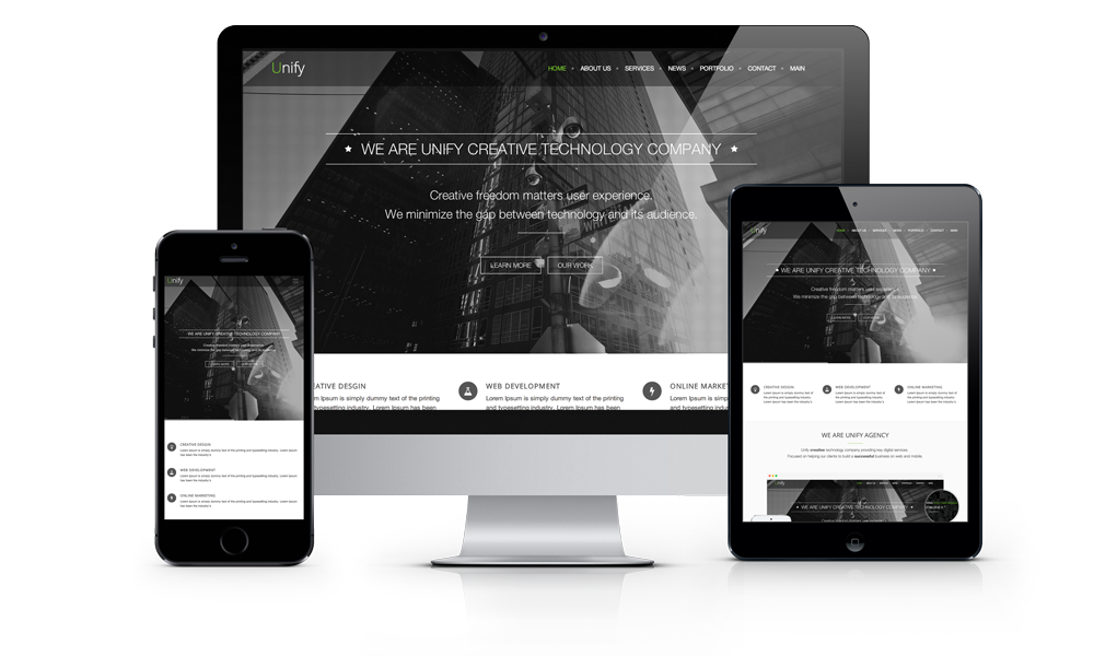
Designing and developing websites that are optimized for mobile and tablet devices is an important aspect of the work we do at BluTekMedia. All of our websites are created using the latest practices in responsive design. Responsive website design technology employs Flexible Grids, Flexible Images and Media queries to adjust content and page elements accordingly. Visitors can browse from desktops, tablets, or smartphones and the website will dynamically resize according to the device’s screen.
Benefits of Responsive Design
Supports Multiple Devices .
Over 56% of American adults own a smartphone and 34% own a tablet. Responsive web design ensures users can access content at home or on the go..
Improves Usability .
Through the use of media queries the width of the browser is determined and the appropriate content is served.This fluid response to various devices makes it easier to navigate and find information.
Increases Performance .
Mobile users are often looking for information quickly and easily. Responsive web design optimizes site code such as HTML, which improves loading times and site speed, keeping users on site longer.

Founder
Jason Marchalonis
”A well designed website does not mean that it meets. It is an important to always develop with a "mobile" first point of view